Showing posts with label Unicorn. Show all posts

Monday, January 10, 2022

Terry Brooks Fan Art Project: Inked Unicorns 'Books of Magic' via 'The Black Unicorn' novel [Magical Kingdom]

 FINALLY!!! 

I'm MAKING THIS PROJECT HAPPEN!

 In the 1987 novel "The Black Unicorn" (remember the "The" so as to distinguish it from "Black Unicorn" [no "The"] by Tanith Lee in the 1990s, which is ALSO GOOD.) Brooks writes about "The Books of Magic" which were a crucial plot point in the narrative of this specific novel, which comes from his "Magical Kingdom" series of Fantasy Novels from the 1980s. 

 You can READ the excerpts from the novel which I posted HERE that describe The Unicorns in the Books of Magic.

@blackunigryphon #FanArt #inkdrawing #unicorns #TerryBrooks #FanArt #book #sketchbook #BooksOfMagic #MagicalKingdomOfLandover #FantasyArt #Fantasy #FantasyNovel #WIP ♬ original sound BlackUniGryphon


I am SO IRKED that I misplaced my original vintage copy of the novel. I literally had the dang thing, highlights withe notes & ALL in my hands in early December, but our Condo had a new electrical system installed in December, which means the entire place was topsy-tervy, and everything moved around. So, even tho I found ALL of my other novels from my teenagehood that were always kept together I CANNOT FIND THAT ONE! 

So, I had to find a digital copy online, and THANK YOU SO MUCH TO FANTASY NOVEL FANS ON THE INTERNET!!!!

I've actually made a number of art pieces since I was a teenager in the 1990s depicting a number scenes from this novel. This novel really showcased a lot of the sweetness of Brooks' heart, and sentimental side. His also uses interesting narrative devices which for its time (1980s) were refreshing, altho today might seem cliche. It reminds me of an Classical Ancient Greek style which involves the mind of the audience (or reader) like in Peter Pan, you need to BELIEVE IN FAIRIES & clap your hands otherwise Tinkerbell will die,  or if you believe in Jesus you become Deliverance & Salvation so you can go to Heaven in the Gospels. These are things the audience that hears or reads the story does INSIDE THEIR MIND by thinking and also FEELING which works very effectively, especially in a play or fairy-tales. 

In Brooks' story, he uses this concept of "The Books of Magic" in a similar manner. So without giving out too many spoilers, these Unicorns which appear to be inked drawing on white parchment paper are actually trapped unicorns. They need to be set free so that the people in other realms (like our own) can "believe in magic" which also gives Magic it's own power. This is a very ancient classical narrative style that was perfected in Ancient Greece. 

I don't want to SPOIL the story, but its connected to The Black Unicorn, which turns out to be NOT WHAT YOU THINK. 

Let's just say, The Black Unicorn IS NOT EVIL, and IS NOT A DEMON. 

YOU NEED TO LOOK PAST it's DARKER EXTERIOR AND SEE THE BEAUTY OF WHOM THEY TRULY ARE. 

The Black Unicorn is INNOCENT

Imagine being misjudge JUST BY HOW YOU LOOKED ON THE OUTSIDE! 

But INSIDE there is SO MUCH MORE!

This is ALSO why THOSE 2 BOOKS OF MAGIC MATTER SO MUCH IN THE PLOT! 


Actually, when I was a teenager in the 1990s I made my own makeshift, hand made, version of the 2nd Book of magic with the Inked Unicorn Drawings! But, after I graduated college in 2001, I was snobby at my old high school art work, AND I THREW IT AWAY! 

OH, HOW I REGRET THAT I DID THIS!!!!! SO STUPID! Me & my STUPID EGO! WHAT WAS I THINKING??? 

I'd made a Painting that had depicted a scene from the book with the fairies Dancing over a Lake at night to summon the Black Unicorn, which I was in high school. I didn't think much of it, but my family found that painting and framed it. I was honestly shocked since they never seemed to give a care about my art, ever. Also, no matter which house they lived in, they ALWAYS took THAT painting with them and HUNG in a room that ALL PEOPLE COULD SEE IT usually when they entered the house. 

The kinds of things people would say to me about that painting were so sweet. So many people would tell me just how much they LOVED that painting! So, I guess I must've tapped into whatever Brooks wrote, because I LOVED that scene in the novel SO MUCH that I went out of my way to make a painting depicting it. I thought I wasn't any good when I made the painting, and felt disappointed that it wasn't better. But, when so many people kept telling me how much they LOVED it, I guess I did it right after all. I guess that's the problem with ego, huh? 

So, by the Pandemic Quarantine Lockdown of 2020, I actually found my novel. Then I thought about "The Books of Magic" with the Inked Unicorns. 

Then I thought: 

Hey that would be a good project! (Then I remembered, I DID do that project as a kid, BUT THREW IT AWAY! DOH!)


So, I'd been meaning to re-create it myself.


I wasn't sure if there was still a Fandom for Terry Brooks. So, I checked! 

Oh! THERE IS!


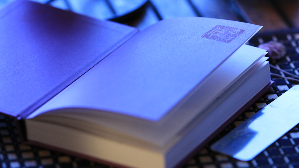
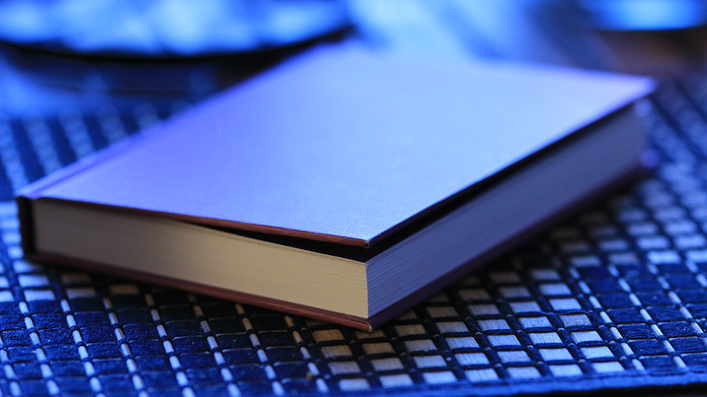
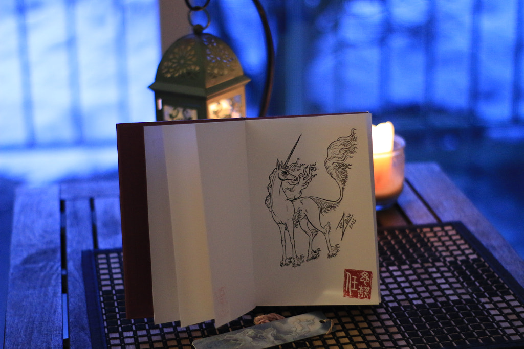
So, I went to Michael's Art Supplies & bought a new hardcover sketchbook for the project.


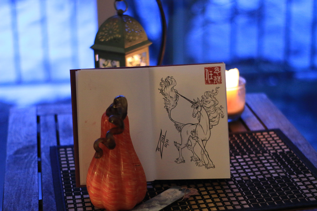
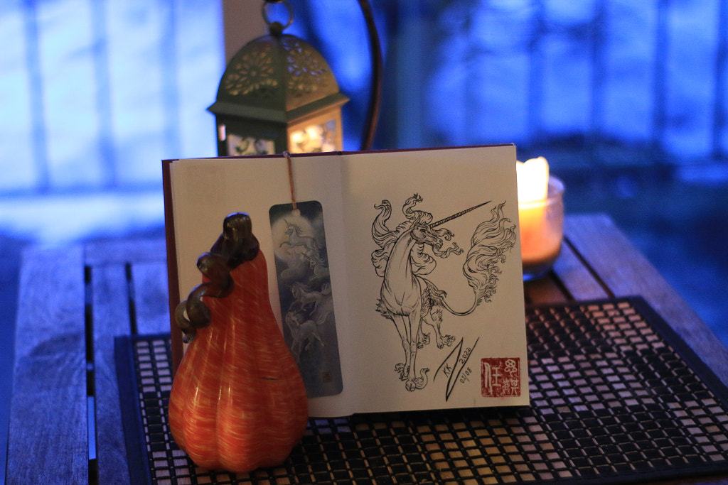
The 1st 2 Inked Unicorn Drawings/Pages are described in the novel as the first one is standing still, and the 2nd is in motion

So, I depicted it this way on the 1st 2 pages:

After that, in mentions the 3rd & 4th as all different, ans all of them after that. (you can read the excerpt here)

If you would like to see my ENTIRE Photography Gallery for this Project as it unfolds go HERE.


Please leave your comments, suggestions, critiques, here on this Blog, or find me on Twitter!

Are YOU a Terry Brooks Fan???

TELL ME! SPILL THE BEANS!!!!


Saturday, September 22, 2018

Sketching, Animation, Filming, N Arts: Summer 2018 So Far

Here it is on DeviantART
Where to start? I'm more than sure I'd doodled out a concept sketch or 2 of this since Winter 2017.

I want this one to be fairly nice, but also simplified ACCORDING TO MY STANDARDS. Not everyone else's version of simple nor simplified is the same as mine. 

I want to do MORE than JUST motion graphics, and since I've been sitting in on classes by AMB Animation and Aaron Blaise since May. But, My goal in doing so much motion graphics was to learn the programs, and these things take time.

I had modified this concept for a proposal I had JUST submitted at the Boston Convention Center. They didn't choose it tho'. That's fine, because Now I can do whatever I want with it.

I'll just post the Proposal versions here:


Here's the proposal version for Boston Convention Center's very long panoramic screen in the lobby:


But, my original concept kind of sprang from my creative whiles of wanting to rec recreate stuff I've seen in Anime, or Mainstream cartoon Intros or Outros but more of a Western Animation style, as interpreted and re-interpreted as my own style.

I want to animate in layers, as I do all things with Adobe, but also in Toon Boom. It's time consuming tho'. I'm less interested in narrative at the moment, and more interested in Subjective exploration, or Mood, or World Building to some degree. Or, even character.

I'm also more interested in composition and framing. I'd spent years on making many images as a whole composition, but it's still. What if that image moved? But, not a narrative. Some old Silent films where a bit like this from France.

However, my muse or inspiration is a really old cartoon from the 1980s (I watched it in the early 80s, but it might be older), ironically, also from France, but produced in Japan: Mysterious Cities of Gold.


It the Outro they have this very simple Motion Graphics & Simple animation that makes use of editing styles/tricks to evoke mood and exigence.


Honestly, I DO NOT care for the ugliness of the anime style or look of the characters at all. I remember loving this show as a little kid, but growing older and trying to watch it was awful. The story telling ability leaves MUCH to be desired. But, the way it evokes mood, and the use of composition is SO GOOD! The use of space, negative space, textured graphics, design, negative space. It's all there. 

So, I wanted to do my own version with my own character(s). 

THAT was the reason I did THESE rough animations last year:


They weren't just some random animated bits. There was a reason, and purpose behind them. I had discussed this concept WITH my classmates at UMASS, so they know it. Actually, if I had been allowed to peruse my studies or projects as I'd wanted to, THIS would've been what I'd have produced. It was also on my List of Goals/Projects I'd been wanting to do.

But you need to learn to crawl BEFORE you can learn to walk. This is ALSO a stepping stone to the larger things I wish to do. Start smaller, then get bigger over time. I've done the motion graphics bits I'd wanted already since the winter. But, they are more still, and emphasize mood, but also clean-up N layers.


Now imagine these styles of clean-up and layers with motion graphics & effects but applied to animated, refined versions of the stuff I had already shown you above.

As simple as that is, these things take time, practice, and work. I would've been done by now if the summer hadn't been as hot, because we don't use air conditioners, but when the temperature goes above 80-85F the video card doesn't work right, and I didn't want to destroy yet another one. Also, it often will refuse to open graphics programs the hotter and more humid it gets.

Honestly, I very rarely see people doing & creating the kinds of things I want to do and create, whcih really surprises me. But, I have seen a few I'd like to mention including 1 of my friend's beautiful animated motion graphics pieces she does:

Lizkay's "Welcome Home", "Majestic", and her whole Animated Gallery has some really nice polished work.

Other Anime or Cartoon bits I'd like to try/do a re-interpretation of are ones like these:


There are just SO MANY beautifully composed sequences in Intro & Outro sequences in Inuyasha which is a MAJOR favorite of mine. They're often VERY subjective, and VERY Emotive, with no narrative, with emphasis on mood. They're a mix & blend of some choice details with simplicity. Some things are TOO simple, like a sticker that doesn't move but moves like a motion graphic... which I kind of hate because it's too much like an animatic that's fully in clean-up. 

I was never really a fan of the old-school anime look, which I often found hideous and ugly with bug eyes or creepy doll eyes. But "Inuyasha" made an effort to make this style pretty, and they often remind me of Chinese Gongbi Art mixed with manga that moves. 

These styles are very calm, and slow moving, which is something I usually didn't do as an artist.


Here's another one I'd LOVE to do my own re-interpretation of. I believe these were produced in Korea. Everything that s is Storm is my favorite, but as a whole I like the entire thing. You CAN, however, tell where they cut corners tho', and didn't shoot on 1s or 2s.

Obviously, these do NOT compare to Disney, nor Glen Keane works such as:


Being that Tarzan is very fast paced, and dynamic, it has a certain look and feel. But it differs from this sequence in Pocahontas:


This Pocahontas Sequence is so good in how it's mood is more slower paced and still, composition-wise, but it has tension building, and flips the mood and emotions several times. 

It was originally storyboared by Glen Keane, and the lead supervising animation was done by veteran animation legends: John Pomeroy and Glen Keane. 

As for compositions in animation that are VERY ADVANCED which I don't think I can even reach yet, there's SO MANY in a lot of Macross series: Macross Plus, Macross Frontier, Macross Delta. And they also have slow emotive moods and fast paced, dynamic, action packed scenes everywhere. They do things with composition, to emulate a camera, that blow my mind.


There are SO many scenes in Macross Plus that use background pans and camera work that are CRAZY! They actually went to an American Airforce base to study aerial flight, and dog fights, and I have NO idea how they shot them, let alone design the background pans. It's all traditional work with lenses. 


By the time they got to Macross Frontier it was very digital, but still very nice, with exceptional clean-up artists.


If you like those, then Macross Delta has so many incredible scenes throughout it as well, and in various tones, moods, and pacing. The story is not the greatest for an entire season, but actually has a happy ending, unlike the typical tragedy-laced themes of Asian media, especially the Macross/Robotech franchise.

But there's no end to the gorgeous artistic visuals in Macross Delta. There's a flying jelly Fish event sequence that's AMAZINGLY GORGEOUS! And several scenes for Mikumo, AXIA, and especially a Scene with Freja falling out of the sky, singing.

There are, however, time where anime cuts corners, and keeps animation cycles an a minimal, and don;t shoot on 1s n 2s. But, the composition is fabulous. Despite the cut corners, many of the ways in which they use composition n storyboard, and framing are so advanced for me. 

So, I probably won;t be getting into anything like those anytime soon. I want to work on my own stuff for a few years, and take my time.

As for the other works I've been doing, it's also very related, even if most people can't see the connections as I do.


You can see some of my other project concept work mixed in on that first page.

This is another motion graphics & Animation sort of moving picture. I will animate the hair in layers, and I have already shot my cloud B-Roll all summer, and I have lots of it.

I will be including it into my Qilin film project.

This style is not anything new and I had seen many similar pieces of art (especially anthro foxes and cats usually in a kimono), but STILL compositions. I'd always wanted to do my own unique version with my own characters. It's basically 1 or 2 figures within a Chinese mountain side garden. I'd seen a lot of these kinds of things in China.

Back in 2002 I was at Antrho Con in Philadelphia and I bought a Portfolio and a few other prints by Dark Natasha including THIS one which I want to credit as my favorite in this style, which also somewhat reminds me of Gongbi paintings.

As much as I like her work, I don't want to do it exactly like hers, but my own version that is more me. I also cannot decide if I want to do spring or autumn, or even red maples.

To give you an example of my own styles of Qilin as Anthro I have THESE:


Obviously, I wouldn't be doing an animated cartoon piece anywhere near this detailed, but more simplified for animation.

I'm STILL working on figuring that out, including the composition layout and framing. I can;t decide how it will be yet. I'm getting closer, but I'm still not there yet. I will eventually get it, but I need to work at it.

The major frustration is due to not being easily able to access life drawing classes. I want a more formal and disciplined study for that.

As you can see in Dark Natasha's piece there's falling flower petals & leaves. SO, i'bve spent quite a lot of time learning & practicing custom making particles in Adobe After Effects CC. I did NOT know how to get that to work for a few years, and was very frustrated.


As you can see, the falling petals in this work is just pink triangles. Literally NO ONE I'd asked knew how to make a custom particle and all the tutorials were outdated and didn't work. NO one at UMASS knew how, and the curator, Jeff, also didn't know how. I must've asked easily 3 dozen individuals, and they also didn't know, including those whom taught After Effects in classrooms, or worked at gaming studios, and NONE of the people whom made tutorials would answer me on: YouTube, Twitter, and Email.

It was my daughter whom helped me to come up with the triangles as a compromise, and even programmed them. Then the curator, Jeff, helped me fix the programming.

Obviously, I've learned a lot more about particles since then, but I still couldn't get a custom particle to work. So, I had to reach out to Adobe and their people in the forum helped me.

So, these are the custom particles I came up with, plus using trackmats:

That was A LOT of WORK! 

Some of the particles are leaves. The leaf was an open source bit I borrowed online. But I want to actually custom make my own soon. I finally got a new scanner.

Other particles are my Black UniGryphon Logo. Some are like falling leaves, and other are like snow fall, or confetti.

So, you can see how a lot of these things are related. I'm often still perplexed about pre-compositions in After Effects, but I'm getting better at it.

Leaves, and Maple Leaves are gonna be a HUGE focus lately, especially since the film I'm a DP 7 Chief Editor & Graphics on is called "The Holy Maple Tree" and we finally did some filming for that. I'm NOT filming today tho'.

I've also been Live Streaming my work on Twitch:


But also the Animated Film I'm doing with my daughter is almost finished. It would've been done in July if not for the heat waves.


Speaking of Maples Leaves, Filming, and Live Streaming on Twitch, I've been working on a headdress for a charter in the film.

Here's the rough concept sketch inspired by a fusion of Ozma, ATS, and Hippie stuff with wire wrapping, beading, and DIY. It will have maple roses like Ozma. 


Watch Highlight: Resume DIY Wire Wrapping Maple Leaf from blackunigryphon on www.twitch.tv


The character's name in Moonbeam, and is a contemporary Hippie. The main character is making his own religion, and she's a follower and groupie of his.
But. characters were recast multiple times, but the ethnic vibe is much better than the original stuff, even tho we did like to other actors. 

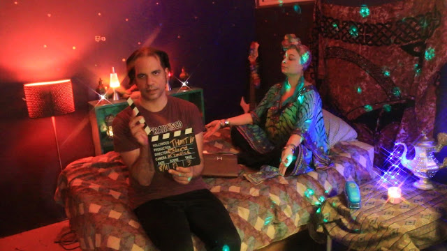
I was on camera in these and helped arrange & light this set. You can see my lights & lanterns, as well and my costume bits. this set was made in the Director's basement. That's him (Roland) with the slate. Shot on my beloved old kit lens with filters.

Location is Brockton MA

"Moonbeam" played by Shevon AKA "Muffin" whom is also a film director & recording artist.My 50mm prime lens
This lens is a 135mm F/2 CANON and it's $1K! Luckily we rented it cheap twice. Like the creamy Bokeh? Shot in Glen Park in RI.

135mm F/2 CANON


Shot at Brina's set in her house.


This film sucked up the majority of my time this year. It's exhausting. But, when it turns out, it's worth it.

I have a lot more coming up for some TV shows I'm producing. I also was doing Videography for HockeyTV. But that's stalled right now.

I expect to be doing more with video art, film making, and experimental video & animation. I've already shot a lot of stuff for those. I expect to film some more when the foliage turns colors.